You may have noticed that Meteo France has launched a new avalanche bulletin on the 15th December 2011. The new format will be issued daily through to April. The new bulletin now covers a single mountain range rather than a department and has graphical elements, in this instance it is following the lead of many other avalanche centers.
The bulletin is published as a PNG image. So what was a 3K text bulletin is now an 85K image. Not great if you have a WAP phone or limited connectivity. It is also harder to print and, of course, you can’t resize the text if you are getting a little short sighted. Oh and you can’t feed it into Google translate for an English (or other version). We are told this is deliberate by Meteo France as they don’t want people making translations.
With the graphical part of the bulletin this is maybe less important than it was. So lets take a closer look at each element.
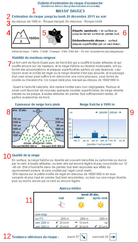
1. This is the mountain range covered by the bulletin
2. This is the date covered by the bulletin, it is a 24 hour period to the evening the next day
3. Here we have the classic avalanche risk on the 1-5 scale, if there is an increase in risk an altitude is given and there are two figures. The altitude often corresponds to the level where it previously rain then the snow was stabilized by a freeze/thaw cycle (iin winter) or the zero isotherm in spring (decreasing risk as you climb)
4. The risk figure is repeated as a numeric value in this graphic. Remember that risks 3 and 4 are in the upper range and require considerable skill when route finding. We shouldn’t be skiing at risk 5.
5. The “rose” gives the slope aspects that are most dangerous. There is still a risk on the other slopes hence the grey/black colouring. In this case NW through to SE slopes are most dangerous.
6. This section requires a bit of french. It is split into the natural avalanche risk (departs spontanes) and the risk of skier triggered avalanches (declenchements skiers). A is a slab.
7. Gives some details about the snow pack stability. It basically gives the reasoning behind sections 4-6.
8. Shows us how much snow there is off piste. This is useful to know at what altitude you can ski to. In this case continuous snow cover is from 500m with 60cm on south facing slopes at 1500m. You could reasonably expect to be able to tour from 700-800m on forest trails.
9. This is how much snow has fallen over the previous 4 days in cm and how much is expected over the next 2 days at an altitude of 1800m. To a certain extend the figures given in 4-6 depend on the estimates. If you arrive on the terrain (remember Munter’s 3x3 method) and there is more fresh snow than you expect from the bulletin you may want to revise the risk level upwards. See also box 11 for the wind direction and speed, if this is different on the day then the risk may be higher or on different slope aspects.
10. This is the snow quality or skiability. Look for the word “croute” (crust) if this is breakable it may cause problems for less experienced skiers and could affect your timing, as could breaking trail in humid snow or deep powder.
11. This is the weather forecast, zero degree isotherm, wind speed and direction, snowline if relevant (could be useful for road conditions). Wind speed will give you an idea of the windchill and what gear you need. If cloud/fog is forecast this augments your risk as you will be unable to observe surrounding slopes for avalanche activity, route finding will be more difficult and it will make rescues harder in the case of an accident. Strong sun would imply wet snow or full depth avalanches later in the day.
12. The expected evolution of the risk: decreasing than stable.
If you can think of anything I’ve missed please feel free to comment.
You can follow the avalanche bulletin on my twitter account: http://twitter.com/davidzof , if there is too much information you may want to create a search filter or twitter list.

